Important things to remember when designing characters for use in 2D:
- Clear shapes -- silhouettes must be instantly recognisable and characters should be defined clearly.
- Distinctive colours -- the characters should be recognisable by colours, or have a 'key' colour associated with them, for use on menus and the like.
- Simplicity in design -- a lot of detail will be lost in the transition to sprites.
Why is colour important? We should be able to tell which characters are on the screen at a glance and whose name is whose on menus. Red and Dark Red are far too easy to confuse, for example.
Why do we lose so much detail? There is only so much screen and thus, only so much room for sprites. They need to be stylish and clear in 2D.
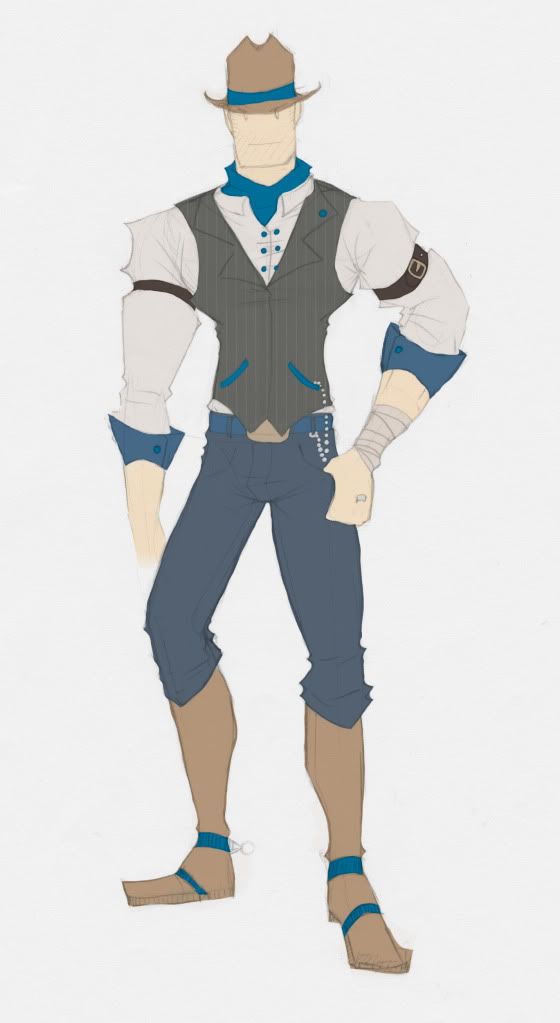
Amadeus: BLUE, TAN
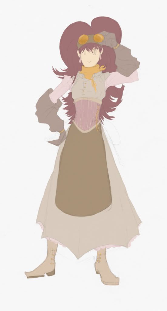
Mandy: ORANGE, PINK, WINE RED
No comments:
Post a Comment